ADC Award Show

Last year’s redesign was the first fundamental overhaul of Bechtle’s visual identity since the company was founded in 1983. Developed in close collaboration with the Peter Schmidt Group, the new design puts the brand’s core front and centre, aligning it closely with the demands of digital communication. It also reflects Bechtle’s ambition to position itself as a modern employer and a future-first IT partner in Europe while boosting brand recognition and reinforcing a strong, positive image.

ADC award


The ADC jury evaluates all entries based on five dimensions—originality, clarity, impact, execution, and emotional resonance. The guiding questions:

  • Is the work original and authentic? 

  • Does it communicate clearly? 

  • Does it shift perceptions? 

  • Is it executed with skill and precision? 

  • Does it bring joy, spark emotion or add value?

A Bronze Nail goes to submissions that meet these criteria and stand out for their exceptional creativity. Bechtle’s new visual identity ticks all those boxes and was developed directly from our own brand DNA: zukunftsstark at its core, supported by the attributes connected, entrepreneurial, and experienced. The circular logo composed of two symmetrical elements symbolises strong connections that channel a world of facets such as experience and future, people and technology, empathy and expertise. The parallelogram at the centre is a nod to Bechtle’s origins and history.

Bechtle CD mockup

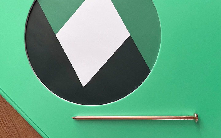
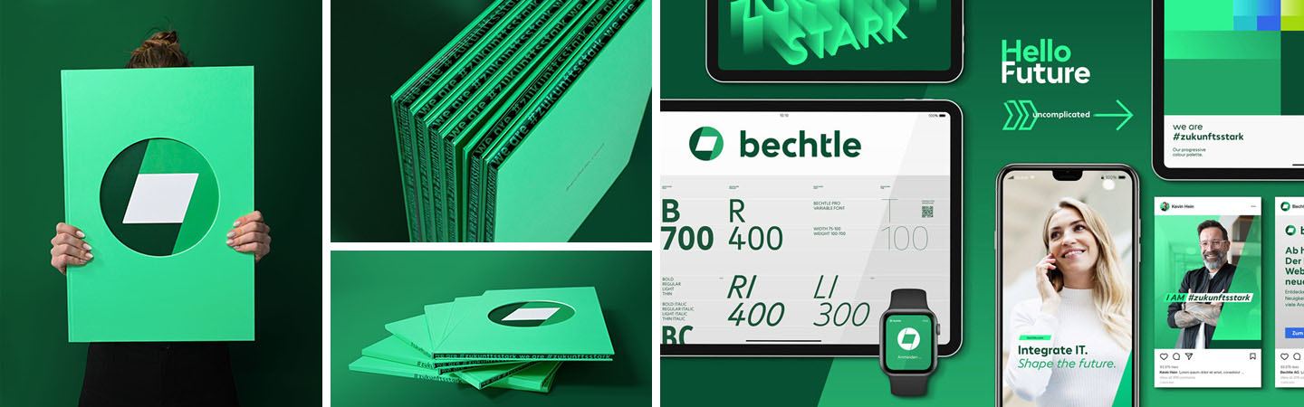
A defining feature of the corporate design is a consistent 19-degree tilt found across all elements: the logo, the lowercase wordmark, custom icons and illustrations, and our own typeface, Bechtle Pro. The result is a distinctive visual identity that connects past and future.

The colour green plays a starring role, setting Bechtle apart in an industry dominated by reds and blues. The three primary tones—Experience Green, Progressive Green and Future Green—combine with white to establish the brand’s signature look. Accent colours like Straight Blue, Energizing Lime and Light Orange add contrast and energy. This vibrant palette isn’t just a visual statement, it also meets accessibility standards for digital media, making Bechtle’s online content easier to navigate for users with visual impairments. 

Please allow cookies to see content from YouTube.

We use YouTube to embed video content on our website. This service may collect data on your activity. For more information, please go to the settings page.


Bechtle unveils new logo and reimagined corporate design

Read the press release